 "Wheelerguy" (wheelerguy)
03/01/2019 at 08:00 • Filed to: Flags, Fun with Flags
 0
0
 8
8|
"Wheelerguy" (wheelerguy)
03/01/2019 at 08:00 • Filed to: Flags, Fun with Flags | 0
| 8 |
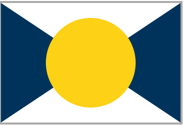
Or at least, here’s the flag of the country itself.
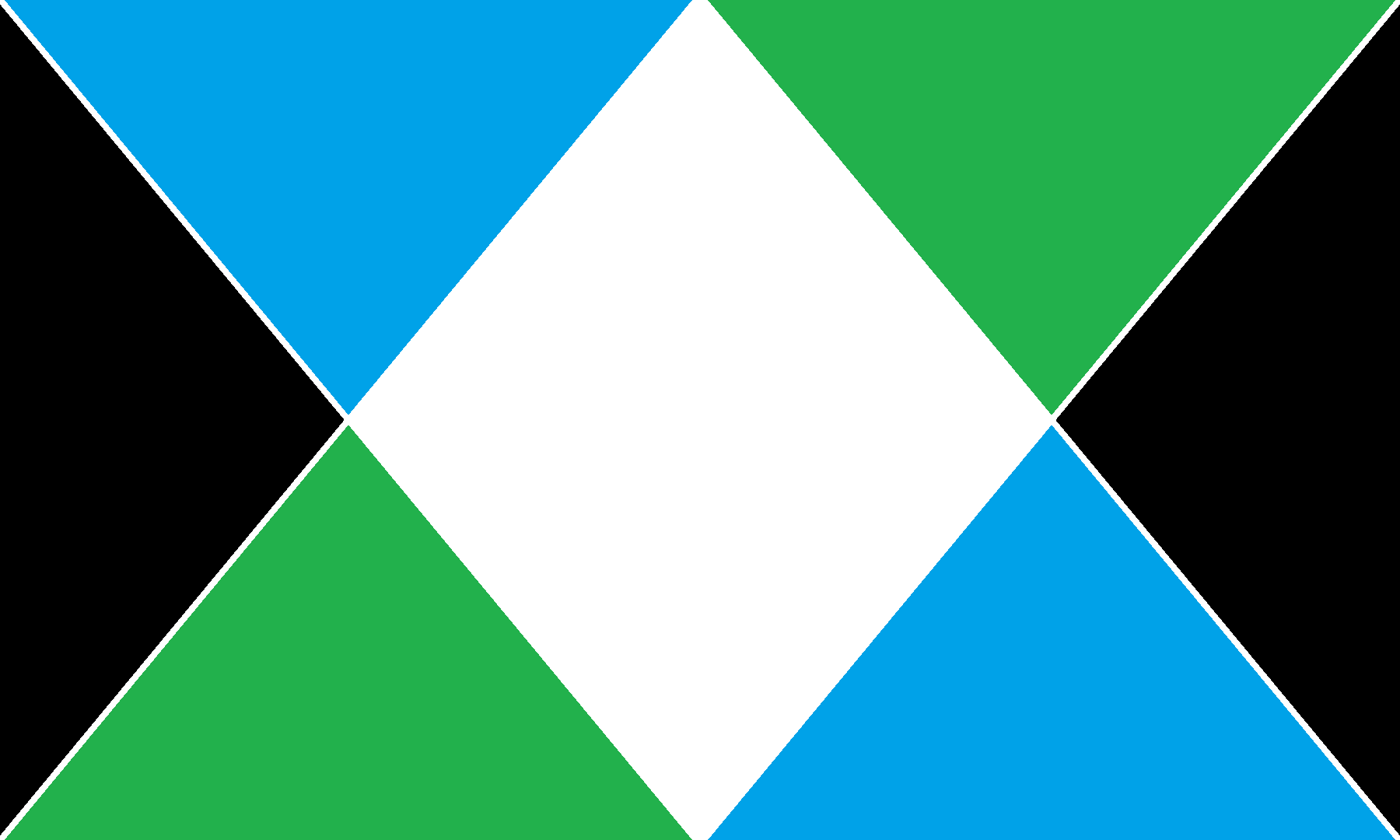
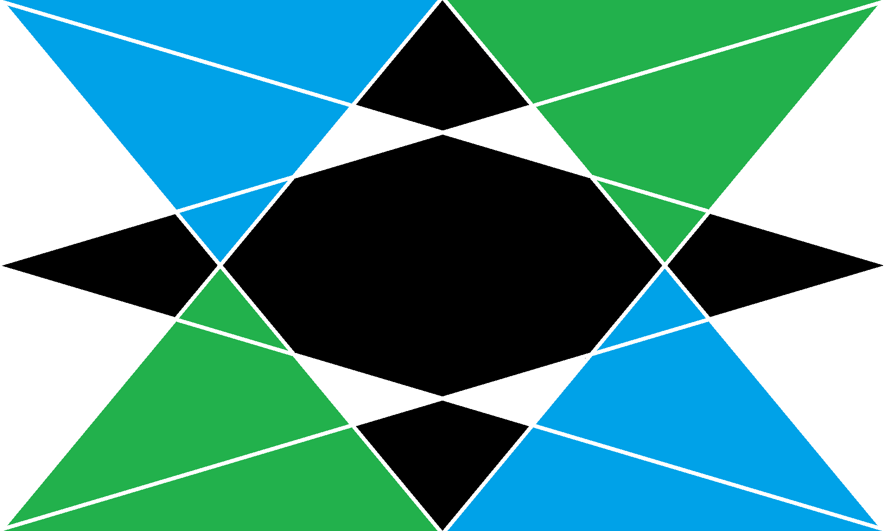
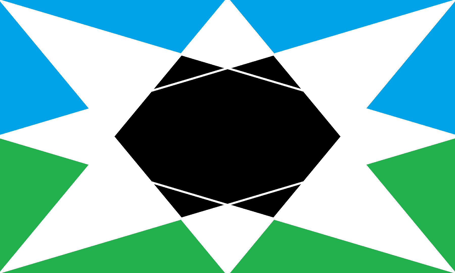
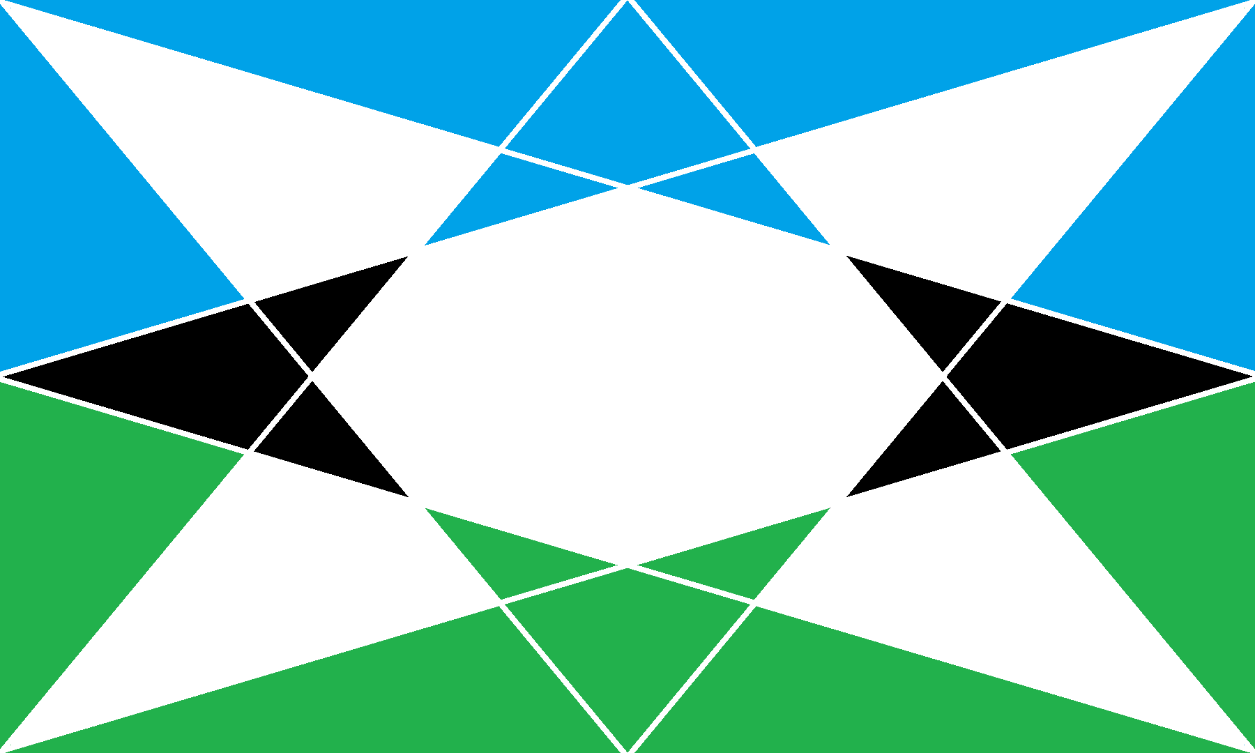
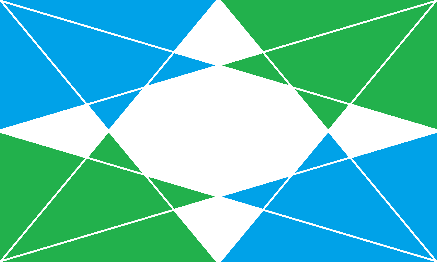
This other proposal is a bit trickier, though. Mixing and matching the shapes and colors is really tricky, but I still want to use negative space as the central symbol for a fairly militaristic-futuristic nation.
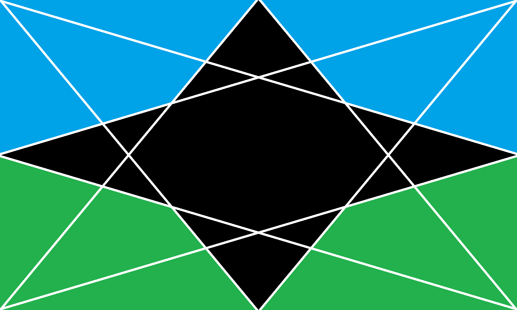
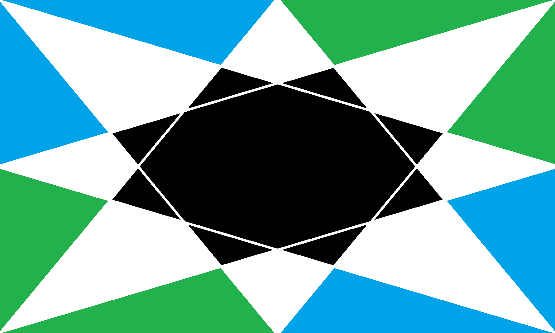
Here are some variations of the second design:
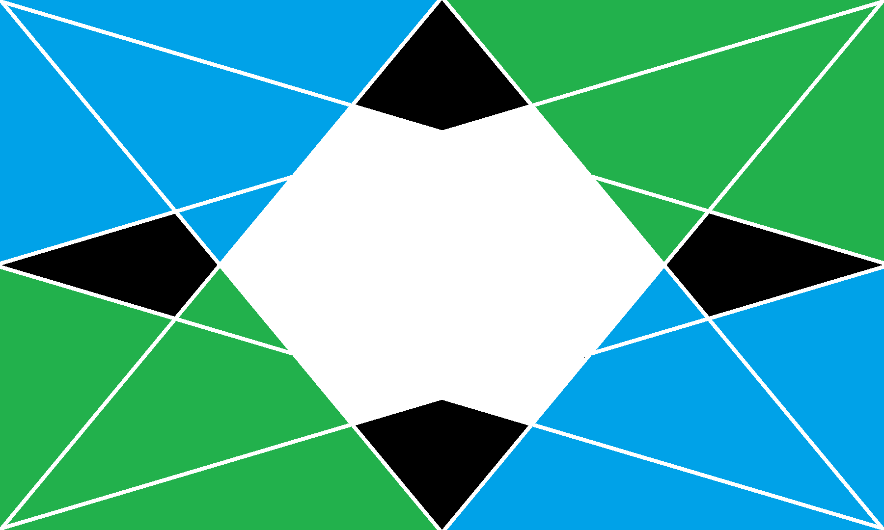
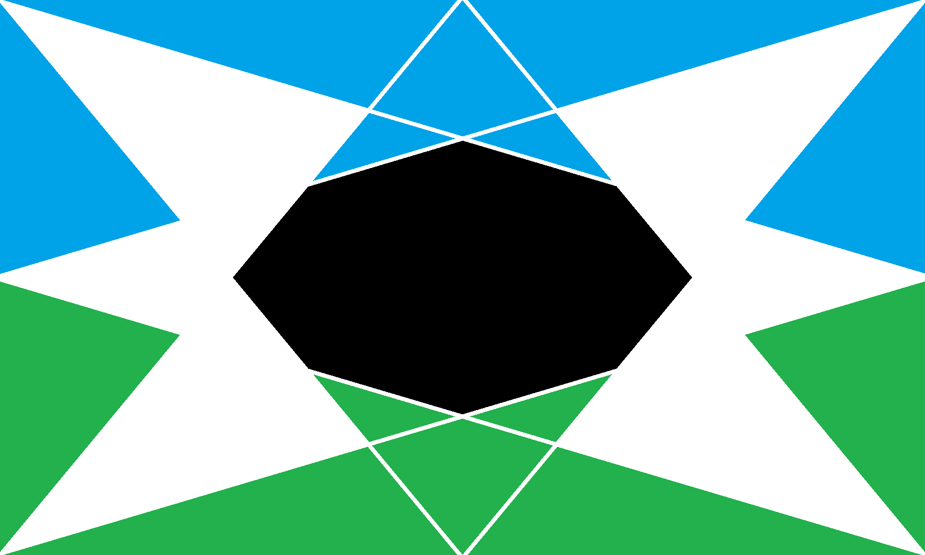
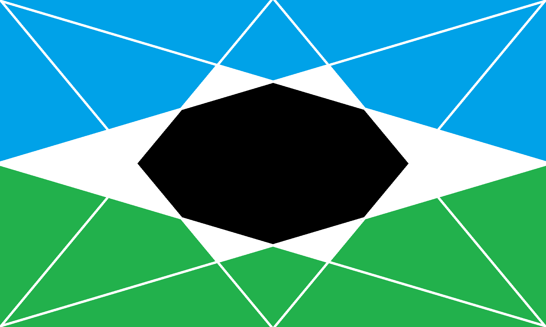
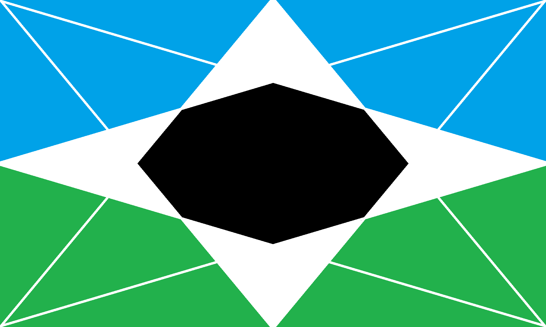
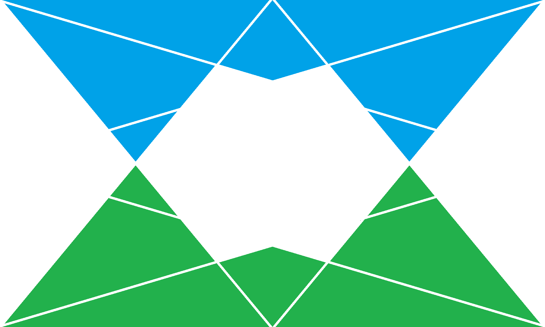
Below is a variation of the lead flag design.
 Nibby
> Wheelerguy
Nibby
> Wheelerguy
03/01/2019 at 08:45 |
|
 MasterMario - Keeper of the V8s
> Wheelerguy
MasterMario - Keeper of the V8s
> Wheelerguy
03/01/2019 at 08:50 |
|
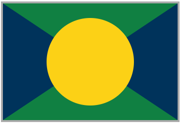
I like the first one. Your post inspired me to create a new flag for Wisconsin since ours is pretty lame. So here is my creation of a flag for Wisconsin. The blue on either side for the waters that border the state (the Mississippi and Lake Michigan), the yellow for the cheese and corn we make, and the white mostly because it looked the best but also for the snow.
|
MasterMario - Keeper of the V8s
> MasterMario - Keeper of the V8s
03/01/2019 at 08:54 |
|
Not sure about this color scheme, but it would represent the state better...the green for the northern forests and the southern farmland
|
Wheelerguy
> Nibby
03/01/2019 at 09:31 |
|
Osea will have none of that bullshit.
 benjrblant
> Wheelerguy
benjrblant
> Wheelerguy
03/01/2019 at 10:07 |
|
99PI is a great podcast and Roman Mars has a pretty good ted talk on flags too:
|
Wheelerguy
> benjrblant
03/01/2019 at 10:15 |
|
I was listening to both of those while making the flags, actually, so a lot of the design is informed by the rules described. How well did you think I fared?
|
benjrblant
> Wheelerguy
03/01/2019 at 10:53 |
|
Pretty great for the use of color and geometric shapes! Somewhat complex geometry though. At least you didn’t put a trade mark on it.
|
Wheelerguy
> benjrblant
03/01/2019 at 10:55 |
|
It’s meant to be intersections of technology and tradition in a country dominated by mountains and split by a river, though I realize that I might as well thicken the lines for it to work.